Taylor Diagram Tutorial 
This tutorial is for creating a Taylor Diagram using CDAT's VCS package.
Taylor diagrams are mathematical diagrams designed to graphically indicate which of several approximate representations (or models) of a system, process, or phenomenon is most realistic. This diagram, invented by Karl E. Taylor in 1994 (published in 2001), facilitates the comparative assessment of different models - for example, to summarize the relative merits of a collection of different models or to track changes in performance of a single model as it is modified. The diagram can also be used to quantify the degree of correspondence between modeled and observed behavior. In general, the diagram uses three statistics: the Pearson correlation coefficient, the root-mean-square error (RMSE), and the standard deviation. Taylor diagrams have been used widely to evaluate models designed to study climate and other aspects of Earth’s environment. (See Wikipedia's page and Taylor (2001) for details.)
Environment version used in this tutorial:
- cdat 8.1
To download this Jupyter Notebook, right click on the link and choose "Download Linked File As..." or "Save Link as...". Remember where you saved the downloaded file which should have an .ipynb extension. (You'll need to launch the Jupyter notebook or JupyterLab instance from the location where you store the notebook file.)
Create VCS canvas
from __future__ import print_function

import vcs
x = vcs.init()
Prepare Input Data
Standard deviation and correlation values are required. The following creates hypothetical input named "data" for testing.
# Create 7 dummy data points representing 6 different models and 1 reference (observational) data point.
import MV2
corr = [.2, .5, .7, .85, .9, .95, .99]
std = [1.6, 1.7, 1.5, 1.2 , .8, .9, .98]

data_tmp1 = list(zip(std, corr))
data_tmp2 = list(data_tmp1)
data = MV2.array(data_tmp2)
data.id = "My Taylor Diagram Data"

print('data:\n', data)
print('data shape:', data.shape)
Plot the initial version using VCS module. "vcs.createtaylordiagram" is for creating the template.
taylor = vcs.createtaylordiagram()
x.plot(data,taylor)

Reference Line
The dotted curved line in the plot indicates a reference line. Let's say your reference data (i.e. your observations) has a standard deviation of 1.2. You may want to move the reference line to cross at 1.2, as shown below.
# Reference point
taylor.referencevalue=1.2
x.clear()
x.plot(data,taylor)

Markers
You may want to distinguish the data points from each other and label them. You can adjust the marker as a shape and/or string, and create a legend.
# Marker attributes
ids = ["A1","A2","A3","B1","C1","C2","C3"]
id_sizes = [20., 15., 15., 15., 15., 15., 15.,]
id_colors = ["red","orange","green","cyan","blue","purple","black"]
symbols = ["square","dot","circle","triangle_right","triangle_left","triangle_up","triangle_down"]
colors = ["red","orange","green","cyan","blue","purple","black"]
sizes = [2., .5, 2., 2., 2., 2., 2.,]
For text strings:
- ids: Data id text strings. It could be model or dataset names.
- id_sizes: Sizes of text id strings.
- id_colors: Colors of text id strings.
For symbols:
- symbols: Shapes of markers.
- colors: Colors of markers.
- sizes: Sizes of markers symbols.
"id_colors" and "colors" are not required to be identical, but it is a good idea in most cases to use the same color for a given text string and its corresponding symbol.
taylor = vcs.createtaylordiagram()
taylor.referencevalue=1.2
for i in range(len(data)):
    taylor.addMarker(id=ids[i],
                     id_size=id_sizes[i],
                     id_color=id_colors[i],
                     symbol=symbols[i],
                     color=colors[i],
                     size=sizes[i])
x.clear()
x.plot(data,taylor)

To adjust the position of text strings to avoid overlapping the symbol, use "xoffset" and "yoffset", which give the relative position from each of the (x, y) points. (The offsets can be positive or negative depending on where you want to position the text string labels.)
taylor = vcs.createtaylordiagram()
taylor.referencevalue=1.2
for i in range(len(data)):
    taylor.addMarker(id=ids[i],
                     id_size=id_sizes[i],
                     id_color=id_colors[i],
                     symbol=symbols[i],
                     color=colors[i],
                     size=sizes[i],
                     xoffset=-2.5,
                     yoffset=-5.5)
x.clear()
x.plot(data,taylor)

An Alternative Way of Setting Makers
Instead of using a "for" loop and the "taylor.addMarker" function, you can store those pre-defined values in the Taylor diagram template directly.
For more information on templates, see the VCS Templates Tutorial.
# The other way to set marker attributes
taylor = vcs.createtaylordiagram()
taylor.Marker.id = ids
taylor.Marker.id_size = id_sizes
taylor.Marker.id_color = id_colors
taylor.Marker.symbol = symbols
taylor.Marker.color = colors
taylor.Marker.size = sizes
taylor.Marker.xoffset = [-2.5,]*len(data)
taylor.Marker.yoffset = [-5.5]*len(data)
taylor.referencevalue=1.2
x.clear()
x.plot(data,taylor)
Create a Connecting Line Between Dots
If needed, you can draw connecting lines between individual data points. In the example below, the line connects all the data dots in the order they occur in the data.
taylor.Marker.line = ["tail","line","line","line","line","line","head"]
taylor.Marker.line_type = ["solid",]*len(data)
taylor.Marker.line_color = ["dark grey",]*len(data)
taylor.Marker.line_size = [5.,5.,5.,5.,5.,5.,5.]
x.clear()
x.plot(data,taylor)

Grouping by Splitting Lines
Let's assume that you want to group your data. You can split a line in two by giving "None" for one of data points.
# Let's split the line into 2 sets of lines with an empty marker in between.
# The first line is dashed.
taylor.Marker.line =  ['tail', 'line', 'head', None, 'tail', 'line', 'head']
taylor.Marker.line_type = ["dash","dash","dash","solid","solid","solid","solid"]
x.clear()
x.plot(data,taylor)

Legend
Instead of the legend at the bottom (the default position), you can move it where you want.
- x1, x2, y1, y2 mark the four corners of the legend box and their values are a decimal fraction of the full page width (x) and length/height (y) which is 1.
# Legend positioning for quadrant 1
x.clear()
template = vcs.createtemplate(source="deftaylor")
template.legend.x1 = .5
template.legend.x2 = .6
template.legend.y1 = .2
template.legend.y2 = .65
template.legend.line = "black"
x.plot(data,taylor,template)

Additional Axes
- You can add isolines to show an additional measure of skill.
- See Figure 10 and 11 of "Taylor 2001: Summarizing multiple aspects of model performance in a single diagram, Journal of Geophysical Research, 106(D7): 7183-7192", for details.
This first example uses the default skill function.
# Skill scores - using the default skill function
x.clear()
x.plot(data,taylor,skill=taylor.defaultSkillFunction)

This second example uses a custom skill function.
# Skill scores - using a custom skill function
import numpy
def mySkill(s,r):
    return (4*numpy.ma.power(1+r,4))/(numpy.power(s+1./s,2)*numpy.power(1+r*2.,4))
x.clear()
x.plot(data,taylor,skill=mySkill)

This third example uses the default skill function from the first example, but uses the template defined above to move the legend to the side.
# Skill scores - using the default skill function + the template to move the legend.
x.clear()
x.plot(data,taylor,template,skill=taylor.defaultSkillFunction)

Two-Quadrants Taylor Diagram
- When you have a negative value for a correlation you may want to expand your plot to the negative correlation quadrant.
- See Figure 2 of "Taylor 2001: Summarizing multiple aspects of model performance in a single diagram, Journal of Geophysical Research, 106(D7): 7183-7192", for details.
# Negative correlation: Two quadrants
taylor.quadrans = 2 # default: 1

# Tweak input data to have negative number
data2 = data.copy()
data2[0,1] = -data2[0,1]

# Plot
x.clear()
x.plot(data2,taylor)

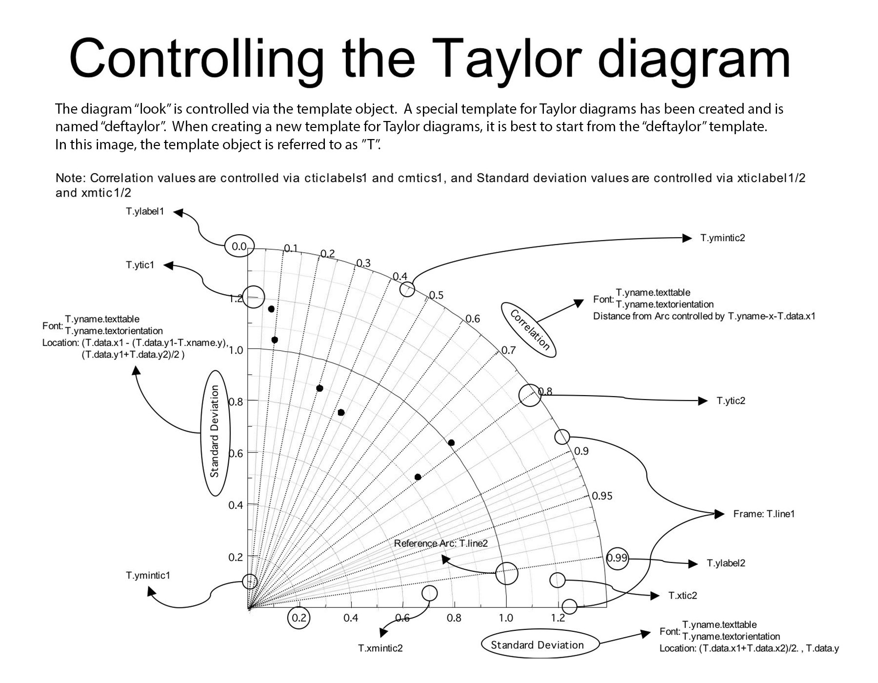
Controllable Components
taylor.list() allows you to check all the components that you can control.
taylor = vcs.createtaylordiagram()
taylor.list()
The CDAT software was developed by LLNL. This tutorial was written by Charles Doutriaux and Jiwoo Lee (18 Sep. 2017), with clarifying edits by Holly Davis (30 Sep. 2019). This work was performed under the auspices of the U.S. Department of Energy by Lawrence Livermore National Laboratory under Contract DE-AC52-07NA27344.
If you have questions about this notebook, please email our CDAT Support address, cdat-support@llnl.gov.